Get the look

Sorry for my absence yesterday. I am trying to only post on days where I have something genuinely awesome to say. No space filler.
Today I am going to revisit the “Get the look” post. This bedside vignette from Summer Thornton is an all time favorite of mine. I love the mix of metallics and the different layers of gold juxtaposed to the crisp white.
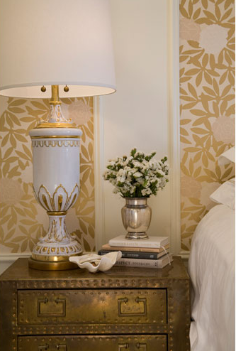
brass chest ::: lamp (or this one, or this one)::: sea shell ::: silver vase ::: wallpaper (email me for more info) ::: books :::

Successful Neutrals

As a designer, I gravitate towards color. I love the strength and personality it brings into a room. However, I have a deep appreciation for neutrals since I think that neutral rooms are the hardest to design. With color, you can lean on a bold chair or piece of art to carry a space, but with neutral, the space has to carry the space.
A well designed, well executed neutral space just sings.

The key to a successful neutral space is texture. Whether its sisal, mirror, or fur you just need a ton of texture. And the best news is that you can insert texture with the help of a couple of my favorite pieces.

What do you like? Color or neutrals?